# 盒模型
# 一切皆盒子
# 修改盒模型
box-sizing: content-box | border-box | inherit;
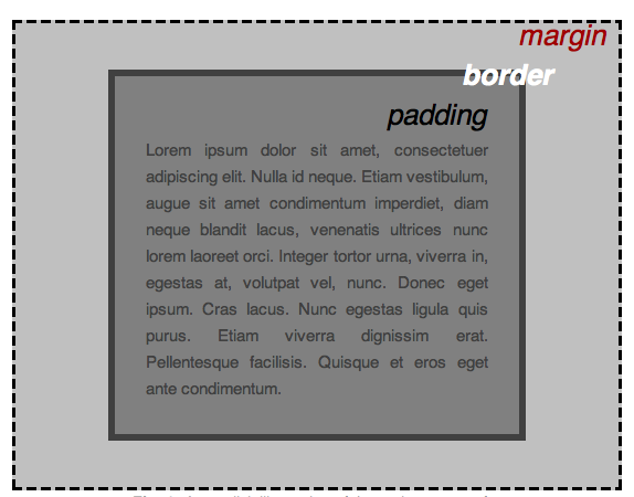
- content-box 默认情况 width = content
- border-box 此情况下 width = content + padding + border;
# 显示类型
display 属性可以设置元素的内部和外部显示类型 display types。
- 元素的外部显示类型 outer display types 将决定该元素在流式布局中的表现(块级或内联元素);
- 元素的内部显示类型 inner display types 可以控制其子元素的布局(例如:flow layout,grid 或 flex)。
常用
.container {
  display: none | inline | block | inline-block | table | flex | grid;
}
分类
.container {
  /* <display-outside> 这些关键字关键字了元素的外部显示类型 */
  display: inline | block;
  /* <display-inside> 这些元素关键字指定了元素的内部显示类型 */
  display: table | flex | grid;
  /* <display-listitem> 将这个元素的外部类型变为块盒,并显示内部类型的多个列表-内联盒。 */
  display: list-item;
  /* <display-box> 这些元素决定是否使用盒模型*/
  display: none;
  /* <display-outdise-inside> 对于不同结构模式的块级和内联级变体需要使用单独的关键字 */
  display: inline-block | inline-table | inline-flex | inline-grid;
  /* 实验性内容 */
  display: run-in | flow | flow-root | ruby;
}
list-item关键字使元素生成一个伪元素,其::marker 内容由其 list-style 属性指定。
none 关闭元素的显示,不影响布局(文件中没有该元素)。所有子项的显示也被关闭。
https://developer.mozilla.org/zh-CN/docs/Web/CSS/display
# 位置大小
width: 默认设置块级元素 content 的宽度
height: 默认设置块级元素 content 的高度
margin: 外边距 多个数值从上方开始顺时针指定
padding: 内边距 多个数值从上方开始顺时针指定
# 盒子边框
border-width: <line-width> | thin | medium | thick;
/* 指定宽度 | 细边线 | 中等边线 | 宽边线 */
border-style: none | solid |dashed |dotted | double;
/* 无 | 实线 | 虚线 |点线 | 双实线 */
border-color: <color>;

border: border-width | border-style | border-color;
/* 简写 */
border-radius: <length> | <percentage>;
/* 多个数值从左上角开始顺时针指定 */
border-image: <image-source> <image-height> <image-width> <image-repeat>;
border-image-source: <url>
border-image-width: <length-percentage> | <number> | auto;
border-image-repeat: stretch | repeat | round | space;
border-image-outset:  <length> | <number>
bordre-image-slice: <number> | <percentage>
border-collapse: collapse;
/* 设置边框合并,常用于表格 */
# 盒子阴影
box-shadow: inset <offset-x> <offset-y> <blur-radius> <spread-radius> <color>;